 The data that you collected can tell you the percentage of food being wasted before and after you implemented a change in your cafeteria. It will also tell you how many students are selecting food items. If food waste has decreased and students are selecting the healthful foods that are being promoted, you know that your efforts have been successful! Sharing your successes is key to gaining support from the school community as well as from parents and district wide stakeholders! The best way to communicate your data is by presenting it in an easy to understand way. This worksheet is designed to help you make your recorded data into simple, straightforward bar graphs that you can feature in school newsletters, at board meetings, or on the school website!
The first step is to organize your data by entering it into a Microsoft Excel spreadsheet. For help using the program, ask a high school business teacher or, better yet, a high school student!
- Enter all of the data as it appears on your Tray Waste Data spreadsheet. Make one spreadsheet for the data collected before you implemented the change and one spreadsheet for after. Each column will represent one tray or student and each row will represent the food item being measured.
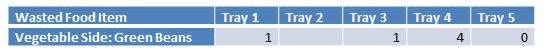
- Next, average each row that represents a particular dish or food group (ie. entrée, fruit, vegetable, grain, milk). The average is calculated by adding all of the data in one row and dividing by the number of students that selected that item. Cells that are blank indicate that that student did not select the item being measured. Using the data below as an example, you would add 1+1+4+0=6 and then divide 6/4. The average of wasted green beans is 1.5.
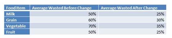
- Convert these averages to percentages by multiplying each calculated average by 25. For example if the average amount of green beans wasted is 1.5, when multiplied by 25 you find that an average of 37.5% of green beans are wasted.
Now you are ready to generate a graph that summarizes the findings. You can create one graph that shows the percentage of food being wasted. You will also want to share the percentage of students that select each item. For example if you are particularly concerned with vegetable intake, it is relevant to communicate the percentage of students selecting vegetables as well as the percentage of those vegetables that students throw out.
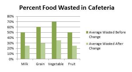
Percent Food Wasted
- In a new Excel “workbook” create a chart that indicates the average percent food waste before and after implementation. For example:
- To make this chart into a graph, simply select all of the cells in your chart (including titles) and click insert > chart > column. You will now see a simple readable graph!
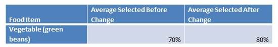
Percent of Students Selecting Each Item
In a new Excel “workbook” create another chart that shows how many students are selecting each food item. To find this data return to your initial spreadsheet and count the students who selected each item and divide that number by the total number of students whose trays you measured. Remember that empty cells indicate that the student did not select that food item. Consider this example again:
According to this chart, 5 trays were measured and of those 5 trays 4 included green beans.
- Once you have the number of total trays measured and the number of students that selected each item, calculate the percentage of students that select each item using this formula: Total # Trays Measured/Trays that included food item X 100 = ______%
- Plug these percentages into your new chart:
- Follow the steps above to convert this chart into a graph:

Using Your Data and Graphs
Bar graphs created in Excel can be copied and pasted into other documents so that you can share your graphs easily! With your easy to read bar graphs you are ready to show off your results!
Beyond how much food is wasted vs consumed, stakeholders may be interested in knowing about the nutritional value of the foods that students eat. Having the weight of each food item recorded in your spreadsheet makes it easy to look up nutritional values. Simply convert ounces to grams (if not already recorded in grams) and use the USDA National Nutrient Database for Standard Reference to find detailed nutrition information about the food item that you are analyzing. If you know how many calories, for example, are in one full serving of green beans and you know that 80% of green beans are being eaten you can easily calculate how many calories from green beans kids are eating by using this formula: calories in one serving X .8 = average calories eaten. This data can also be easily shared with a bar graph by following the instructions above.
Contributors
Drew Hanks, Cornell Center for Behavioral Economics in Child Nutrition Programs
Katherine Baildon, Cornell Center for Behavioral Economics in Child Nutrition Programs
For more information
Tray Waste Part I: Determine the Impact of Lunchroom Changes by Measuring Tray Waste
Tray Waste Part II: 5 Simple Steps to Efficiently Measure Tray Waste